Home Staging Trends for 2020
21 March 2020
Hey guys! I’m very happy to introduce you to this brand new post on Home Staging Trends for 2020! Do interior design trends matter in Home Staging at all? Of course, they do! They just need to be applied skillfully. Unfortunately, I keep hearing that good Home Staging should be painfully neutral and that it should please everyone. You know very well that you can’t please everyone and that is why this bland Home Staging will simply suck. Strong words, I know but in a world where everyone wants to feel like an individual, where women with strong characters develop their passions and dreams (and obviously, they are the main decision-makers when it comes to buying apartments) you can’t always go with the neutral look.
Elements that add character to the property, a kind of an edge and a distinguishing feature, if properly applied, make the customer immediately know that this property is for them. They won’t even have anything to compare it with, in a market where everything is pale-neutral-grey. I am so confident about it because I have tested it many times both on properties working for me and those making money for my clients for whom I have done Insta Staging – Home Staging Trends 2020 in a brand new, Instagram way. So let’s get started!
COLOR TRENDS FOR 2020
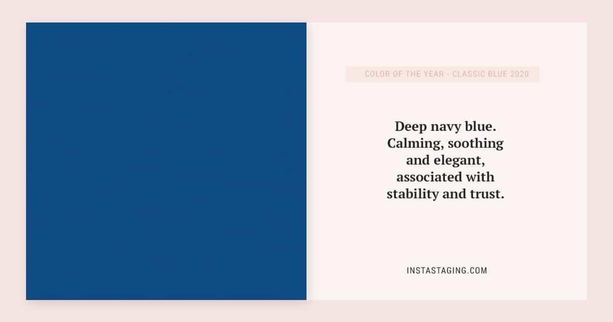
Every year designers are eagerly waiting for the color of the year to be announced by Pantone, who have been debating on it and the trends for the upcoming year the year earlier. The chosen color is supposed to match the present times, with what people feel and how they live. What they wear, what they watch, what they think and what inspires them. All this is to be associated with the selected color. It’s not surprising then that the color Classic Blue – deep navy blue – was chosen for Home Staging Trends 2020. Calming, soothing and elegant, associated with stability and trust.
HOW TO USE THE COLOR OF THE YEAR – CLASSIC BLUE 2020
You can use navy blue furniture such as sofas, armchairs, chairs, nightstands or a dresser with navy blue fronts to create an interesting effect. Navy blue looks fabulous with golden accessories, white wood, white color, and light greys. A composition made of these elements will look very elegant and classy. If you wish to create a more contrast combination you can add yellow elements in your interior (you will find more tips on combining colors in my e-book).
One whole wall painted in navy blue is also a great idea in a bedroom for example. It gives the room character. What you need to know is that such a dark color might optically reduce the space and that it’s good to paint the remaining walls a lighter color so it wouldn’t feel too overwhelming.
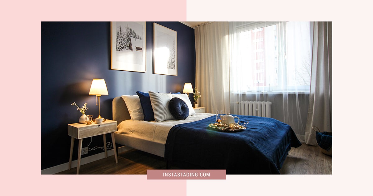
If you want to add navy blue to your interiors don’t forget to use it at least 3 times. It will make the whole interior look more harmonious (so for example – a navy blue wall, cushion, and a vase, etc.).
DIFFERENT COLORS OF THE YEAR 2020
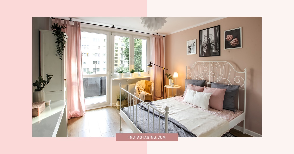
Apart from the color of the year chosen by Pantone, there is also a whole range of colors of the year offered by paint manufacturers. It wasn’t a surprise to me that pastel colors come into play now – gray mint (the color of the year from Duluxa) or powder pink (even called the new white, look at Benjamin Moore for inspiration). I use these colors for about 2 years now in my stagings and I see the huge impression they make on my clients when they are used right and decorated with accessories fitting the right target group. Look at these photos from the last two years – pink and mint rule! Clicking on the photo above will redirect you to my Pinterest. I will keep on adding more of my stagings so follow me there to get more fresh inspirations.
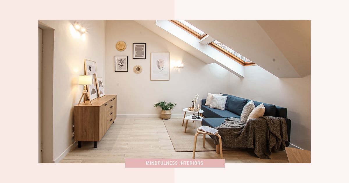
MINDFULNESS INTERIORS
You need to remember this term if you want your property to be on the top of the most wanted list. According to Pinterest the number of people searching for interiors using the word “mindfulness” increased by 250% in the past year.
What does “mindfulness interiors” mean? It means interiors prepared consciously following the idea of sustainable development, but also those in which you can relax, rest, gain energy and escape from the hustle and pressure of today’s world. It’s necessary to designate relaxation zones in such a space, e.g. places to read in natural light.
It certainly doesn’t mean flashy images with speeding trains but rather everything we associate with nature and peace. A sustainable apartment is not cluttered. Each item has a specific function here or even sometimes multiple functions like multi-functional furniture for example.
Same with the color palette, which is associated with earth colors and is completely neutral – beige, natural subdued greens, delicate browns, grays. Materials are all about nature too – cotton, linen, wicker, wood, stone, bamboo. In mindfulness interiors, there’s also a place for handmade products – ceramics, braids, macramé – things with meaning given to them by their creators’ handwork, imperfect and unique.
TREND MIXING AND MATCHING
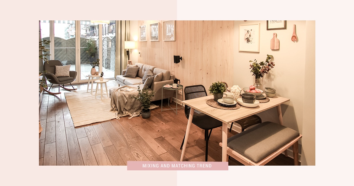
For another year, we can focus on creativity – instead of a set of chairs for the table, you can choose different colors or different materials within the chosen color palette and the materials selected for your interior. The same applies to lamps. Instead of two identical side by side, you can use different shapes or different colors that will match each other. I’ve described this phenomenon in detail in my e-book on Home Staging Trends 2020, because I noticed this trend much earlier and now it’s practically a norm (HERE you can download a fragment of my e-book). This trend also involves mixing styles but I would be really careful here because without proper knowledge you can mess it up so it’s safer to stick to mixing different chairs, lamps, and tables.
WHAT ELSE?
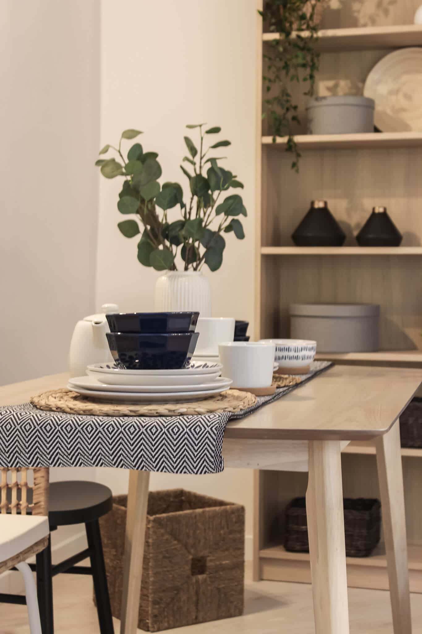
I really like the trend of the lack of a formal dining room. Today people get more attracted to dining rooms which can be associated with a homely atmosphere, kitchen warmth and … granny. What makes that impression? Mostly mixed chairs (there’s always more guests at granny’s than there are chairs, right?) and kitchen bench seats which are really popular in interior design these days. Kids love bench seats but so do adults. It’s because they can always fit more people than chairs can, and they add +1000 points to family warmth. This is definitely my favorite trend!
GET A DISCOUNT!
If you want to find out more about Home Staging, its entire process and learn the secrets of sensory marketing in real estate, download a free fragment of my e-book and get USD 10 discount 🙂
WANT TO KNOW MORE TRENDS FOR THIS YEAR?
I have a surprise for you ☺ In this post I have described only a few trends, buuut… the “Home Staging Trends 2020” guide is ready – and this is a gift for everyone who has already bought or is going to buy my e-book “Home Staging. How to effectively prepare an Instagram interior to make a good profit.” .
“Home Staging Trends 2020” guide will not be available in any other form to buy – it’s a gift for people who know the value of Home Staging and who want to stand out on the real estate market and earn the maximum. I thought that it should be given to people who already know how to apply the entire Home Staging strategy so that they can implement the trends skillfully and make a profit. And to make them stand out on the real estate market and make their projects the most desirable – regardless of whether they are investors, brokers or home stagers. For me, the results of my readers are the biggest reward and satisfaction and that’s why I’ve decided to help them achieve even better results this way.

Colors sure does matter a lot when staging a house. That’s for sure. Pink and mint sure looks great but i just love how navy blue looks on the whole wall.